Hyllo
A mobile e-commerce platform for the fashion and beauty industry.

Summary
Hyllo is a mobile-first e-commerce platform designed to deliver a seamless and visually engaging shopping journey for the fashion and beauty industry. The project focused on building a complete design system and intuitive user experience from the ground up to encourage discovery, simplify the path to purchase, and build user trust.
Confidential (eCommerce Sector)
Client
Lead UI/UX, Design System, Prototyping
Contributions
3 Months
Duration
eCommerce Mobile App
Type
Processes
01
/
Requirements & Definition
Requirements Analysis, User Stories, Problem Definition
02
/
Ideation & Wireframing
Concept Sketching, User Flows, Low-Fidelity Design
03
/
UI Design & Prototyping
High-Fidelity Screens, Interactive Prototypes, Iteration
04
/
Validation & Reflection
Design Critique, Feedback Synthesis, Final Learnings
The Challenge
In a crowded fashion and beauty market, a new e-commerce app must do more than just function—it needs to build trust and confidence. The challenge was to design a mobile-first experience that was intuitive and engaging from the first tap, encouraging discovery while simplifying the path to purchase.
The Solution
The solution is Hyllo, a modern e-commerce app built on a robust design system. By focusing on a clear information architecture and streamlined workflows for key tasks, the design reduces friction and creates an enjoyable, seamless shopping journey from start to finish.

My Role & Approach
As the lead UI/UX designer on this project, my responsibility was to take the client's high-level requirements and architect the entire user experience and visual interface. I worked to establish a complete design system in Figma, creating all components, wireframes, and high-fidelity screens.
My approach was centered on creating a scalable and consistent design foundation. I focused on building a system that was not only aesthetically pleasing but also highly functional, ensuring that every design decision contributed to the primary goals of user clarity and ease of use.
Building the Design System
A robust and scalable design system was established in Figma to ensure consistency and efficiency throughout the project, covering everything from typography and color styles to interactive components.
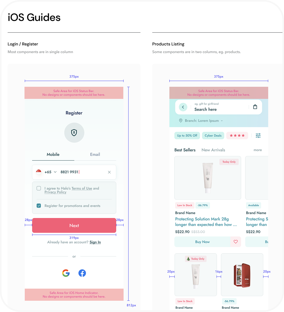
A clear system of colors, typography, and spacing was defined based on iOS guidelines to create a cohesive and professional visual language for the entire platform.
Design Foundations
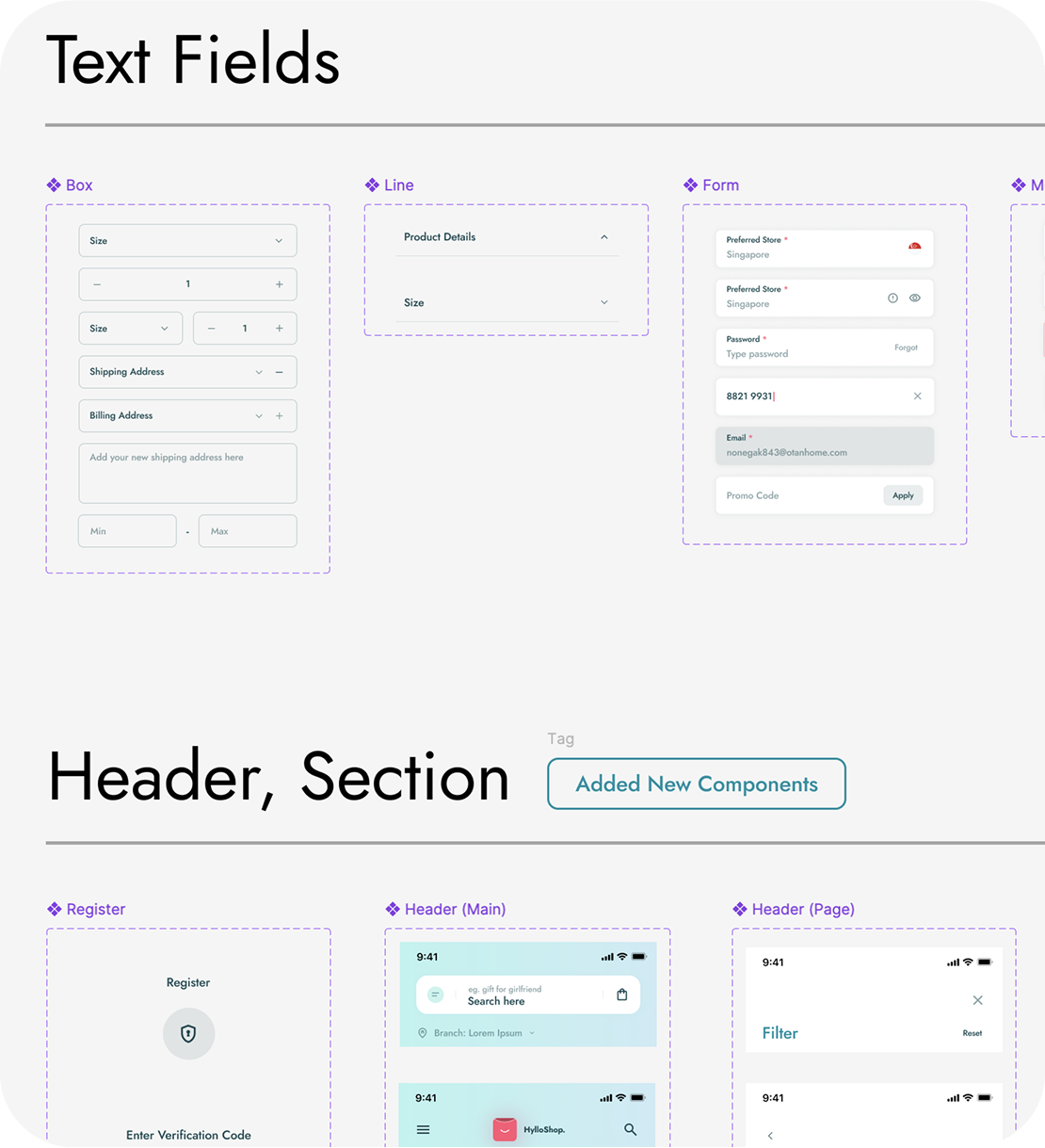
Key UI elements, like text fields and headers, were built as flexible components with multiple states to ensure a consistent user experience across complex forms and sections.
Reusable Components
The project was organized with a clear page structure in Figma, separating the design system, wireframes, and final screens to create an efficient workflow for design and developer handoff.
The Workflow

1
From User Story to
UI Solution
A core part of my process was exploring multiple design solutions for critical user flows to find the most effective approach.
2
Example User Story
from Client
"As a shopper, I want to easily manage the items in my cart and proceed to checkout with minimal confusion, so I don't abandon my purchase."
3
My Design Solution
For the shopping cart and checkout flow, I designed and prototyped three distinct versions (V1, V2, V3). This iterative process allowed us to evaluate different layouts for displaying product details, shipping costs, and payment options. The final chosen design was a multi-step, transparent process with a clear progress indicator, which tested best for user clarity and reduced the cognitive load of checking out.
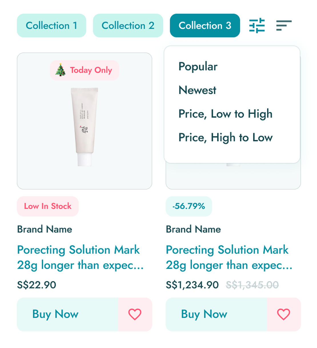
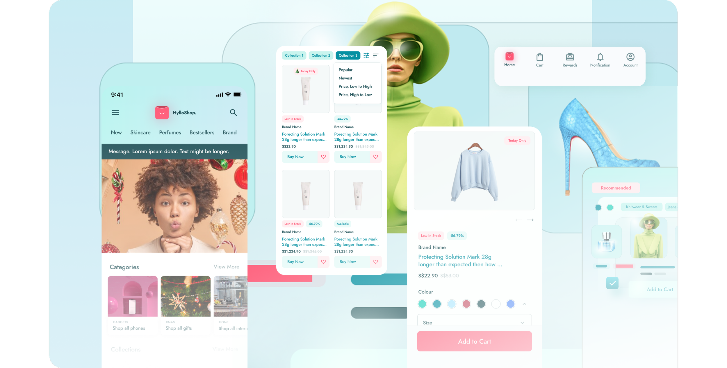
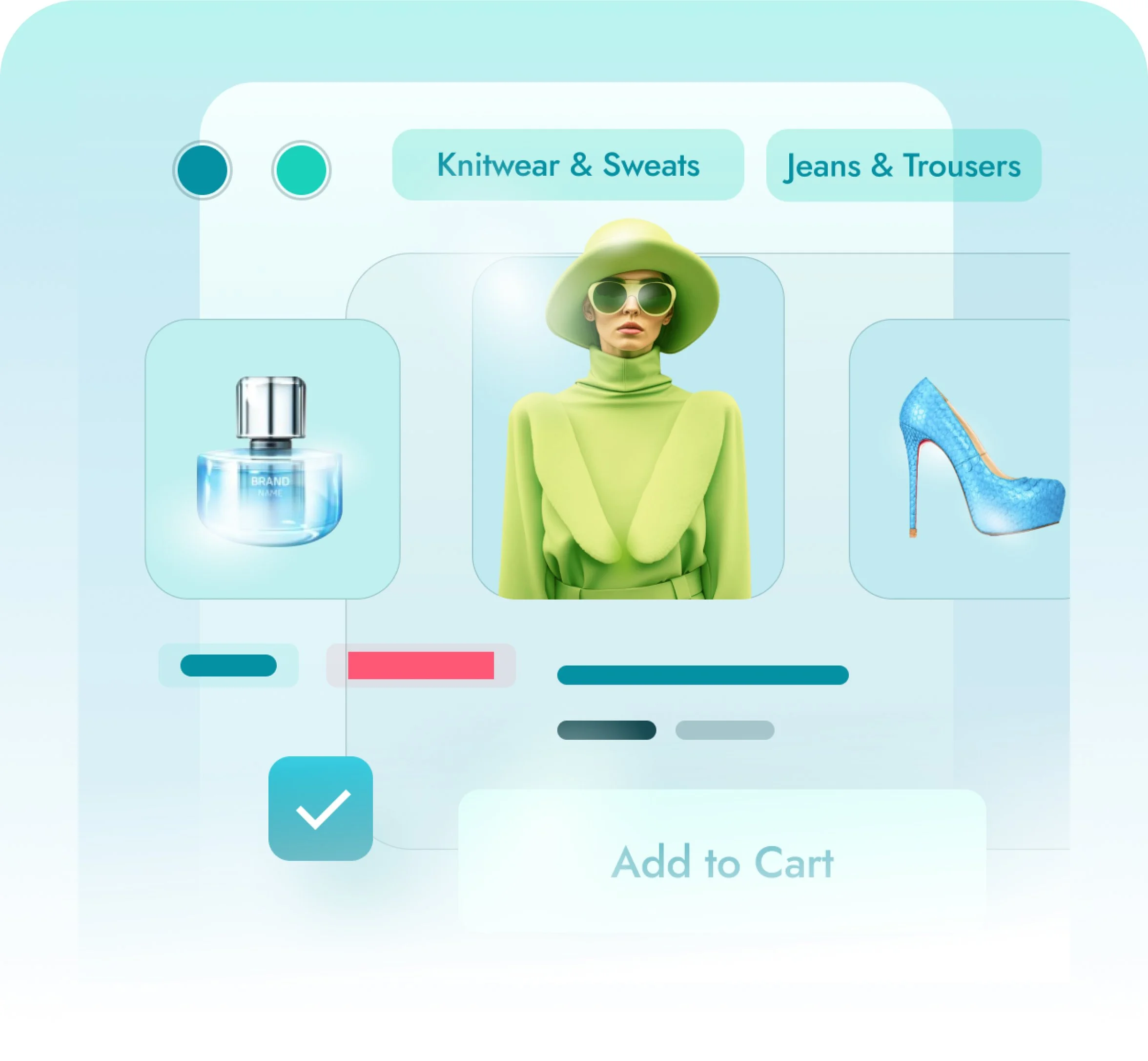
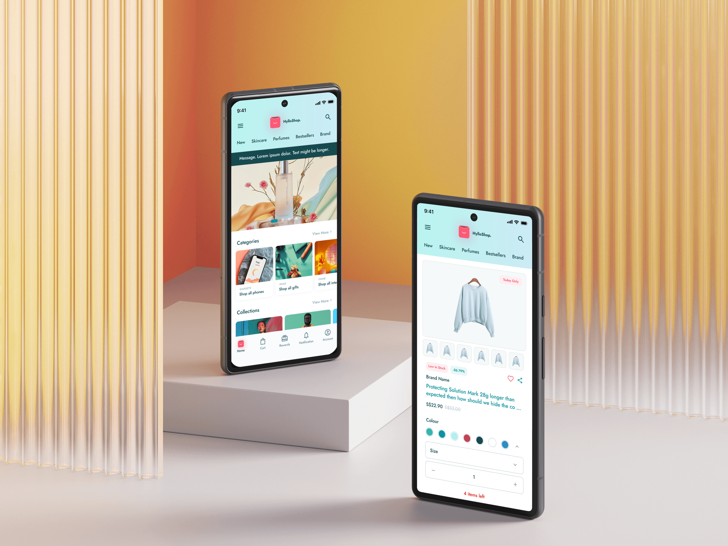
A streamlined product listing page with powerful, easy-to-use filtering options that allow users to quickly find exactly what they're looking for.
Intuitive Product Discovery
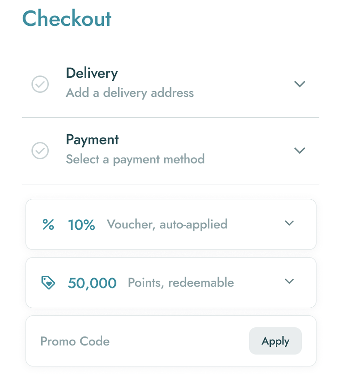
A carefully designed, multi-step checkout process that guides the user seamlessly from adding their address to completing the payment.
Frictionless Checkout
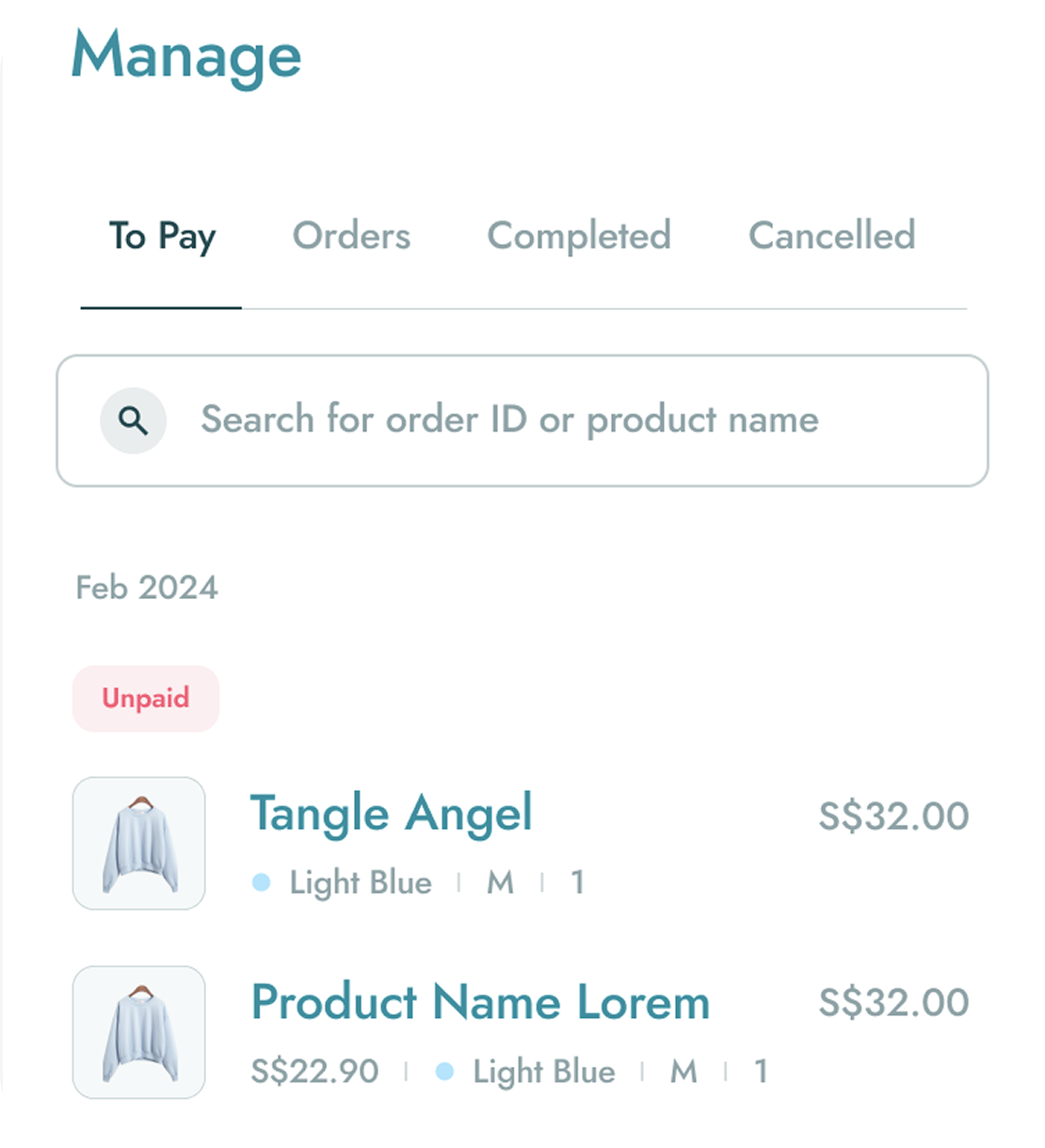
A clear and organized section for users to track their current orders, view their purchase history, and manage returns or refunds.
Order Management
Showcase